




 " alt="">

















At some point during any analytics onboarding, someone says “we’ll just connect to the Zenoti API,” and everyone nods, and half the room doesn’t know what that means. This guide is for that half of the room — ten short chapters covering how your data moves, where it lives, how it becomes a dashboard or an AI answer, and how HIPAA fits in. Zero jargon left undefined; every term also lives in the glossary at the end.
Chapter 01
How Your Data Moves: APIs, Explained Without Jargon
At some point during any analytics onboarding, someone says "we'll just connect to the Zenoti API," and everyone nods, and half the room doesn't know what that means. This chapter is for that half of the room.
The restaurant
An API (Application Programming Interface) is how one piece of software asks another piece of software for something. The best analogy is a restaurant. You don't walk into the kitchen and cook your own meal. You tell the server what you want, the server relays it to the kitchen, and the food comes out. The kitchen never talks to you directly, and you never touch the stove.
The server is the API. The menu is the API's documentation: it tells you exactly what you can ask for and how to ask. Order something not on the menu and the server politely declines. When an analytics platform "connects to" your EMR, it becomes a customer at that system's restaurant, ordering data off the menu the vendor's own engineers wrote, one request at a time: "the appointments updated since 2pm, please." Nobody is inside your system's kitchen. Nobody can be; the API is the only door, and it only serves what's on the menu. Your software vendor built that door on purpose, precisely so other tools could work with your data safely.
Is it secure?
Two mechanisms make the answer yes, and they're the same two your bank relies on. First, API traffic travels over HTTPS, the encrypted connection standard of the web; anyone intercepting it sees scrambled text. Second, every request is authenticated: your systems only answer callers presenting valid credentials, which you grant (usually by clicking "authorize" in a login flow) and can revoke at any moment. Connecting an analytics platform means granting it a key to order from the menu. It never means handing over the kitchen, and analytics connections are typically read-only: the key can request data, not change it.
Why the first sync takes hours
APIs don't hand over millions of records in one gulp. They serve data in pages, often 100 records at a time, and the connecting platform requests page after page until it has everything: every guest, every appointment, every invoice, going back years. A mid-sized group's history can be tens of thousands of polite requests standing in line, which is why an initial sync is measured in hours. It happens once. After the initial load, syncs pull only new and changed records, which takes minutes.
APIs also enforce rate limits, caps on how many requests a caller can make per minute. That isn't stinginess; it's your EMR protecting the system your front desk is using right now. A well-built data platform works within those limits by design.
The one thing that will eventually happen to you
The most common hiccup in any data connection is expired credentials, usually self-inflicted innocently: someone changes a password, or the staff member whose account authorized the connection leaves and IT deactivates the account. Data quietly stops updating. The fix takes a minute (re-authorize); the prevention takes one line on your offboarding checklist ("check which integrations this person's account authorizes"); the detection takes one glance at your dashboard's freshness timestamp.
And if one of your systems has no API at all? Fallbacks exist, from scheduled exports to older automation techniques, each less reliable than a true API. A trustworthy analytics partner tells you plainly which tier each of your systems is in, rather than pretending everything is a first-class integration.
The takeaway: "Connecting via API" means requesting your data through the front door your vendor built for exactly this purpose, over an encrypted connection, with credentials you control and can revoke.
Chapter 02
Where Your Data Lives: Databases in Plain English
Every system you run on (EMR, point of sale, booking, accounting) sits on top of a database: an organized place to store information so it can be found again. Every database does two jobs: store data, and answer questions about it. Your front desk types a name; the database answers with that guest's history.
The vocabulary that unlocks everything
Most business databases organize data into tables: grids of rows and columns, like disciplined spreadsheets. A column is a kind of information (first_name, appointment_date, amount_paid). A row is one record: one guest, one appointment, one invoice. A field is a single value where a row meets a column. And a schema is the blueprint: which tables exist and what columns they have. When a data person says "let me look at the schema," they mean the structure, not your data.
Tables connect to each other through keys. A primary key uniquely identifies each row (guest #12345 is exactly one person). A foreign key is a column pointing at another table's primary key: the appointments table carries guest_id 12345, linking each appointment back to its guest. This linking is what makes a database relational, and it's why a system can answer "show me every guest who visited last month" by following the connections. Virtually every system you use works this way.
The two families: built for running vs. built for analyzing
The distinction this whole guide returns to: Transactional databases (OLTP) handle a high volume of small, fast operations: a booking, a payment, a check-in, thousands per second, none of which can be lost. This is what runs your business and what sits under your EMR. Analytical databases (OLAP), better known as data warehouses, do the opposite job: answering big questions across millions of records at once. A system optimized for one job is structurally bad at the other.
That single fact explains why your EMR's native reports are slow or limited (Chapter 4 tells the full story), and why analysis happens in a separate place.
Words you'll hear and can now decode
SQL is the near-universal language for asking databases questions; Chapter 5 teaches you to read it. An index is like the index of a book: it's why finding one guest is instant while an unindexed search crawls through every row. A backup is a restorable snapshot; a replica is a live synchronized copy kept for safety or for running reports without slowing the main system; uptime is the percentage of time a system is available ("three nines" is 99.9%). You don't manage any of this. You just no longer have to pretend you know what it means, because now you do.
Chapter 03
How Data Travels to Your Reports: ETL and Syncing
Your data is created in one set of systems and analyzed in another. The process that moves it is called ETL: Extract (pull the data out of the source, usually through its API), Transform (clean and reshape it), Load (write it into the warehouse). The modern variant, ELT, loads the raw data first and transforms it inside the warehouse, because modern warehouses are powerful enough to do the heavy lifting. Either way, the job in one sentence: get data from where it's created to where it can be understood.
Syncs, not magic
Data pipelines run on schedules. Every hour or few hours, the pipeline asks each source "what's new or changed since last time?" and copies the answer over. This is an incremental load, and it's what makes ongoing syncs fast. (Its heavier cousin, the full load, re-copies everything, and is used when a source can't report what changed.) The most precise technique, change data capture, reads a database's internal change log and catches every insert, update, and delete as it happens.
Two practical consequences for you. First, your dashboards reflect the last completed sync, not this second, which is why every good dashboard displays its as-of time. Second, when a sync breaks, it's nearly always one of the three failures from Chapter 1: expired credentials (yours to fix, one minute), rate limiting (self-heals), or a source outage (nobody's, retries automatically).
History: the question worth asking your vendor
When a record changes at the source, the copy in the warehouse must change too, and there are two philosophies. Latest-state keeps only the current version of each record: compact, and right for most reporting. Append-only keeps every version forever: a full audit trail, and right for anything where "what did this look like in March?" matters. Both are legitimate; the question "do you keep history, and for what?" tells you a lot about how thoughtfully a platform was built. (The related failure, counting every historical version of a record as if each were separate, is one of the classic causes of inflated numbers, and Chapter 10 shows you how to spot it.)
The pipeline, end to end
Putting Chapters 1 through 3 together, here's your data's actual journey: your staff uses the EMR and POS all day, and every transaction lands in those systems' databases. On a schedule, an ingestion pipeline extracts new records through each system's API and loads faithful copies into a warehouse, organized by source. Transformation then turns those raw copies into clean, well-defined tables (Chapter 6), which power every chart on every dashboard (Chapter 7) and every AI answer (Chapter 8). Every number you'll ever see traces back through this pipeline, which is precisely why, when a number looks off, the pipeline is where the answer lives.
The takeaway: Dashboards reflect the last completed sync. The as-of timestamp isn't fine print; it's the answer to half of all "this number looks wrong" moments.
Chapter 04
Where Analysis Happens: The Data Warehouse
"My EMR already has all my data. Why do I need another system to analyze it?" It's the most reasonable question in analytics, and it deserves a real answer.
The front-desk problem
Picture your busiest location on a Saturday. The front-desk system is checking guests in, taking payments, and updating the schedule a hundred times an hour. Now someone in the back office runs a two-year, all-locations revenue report against that same system. The report has to read every transaction ever recorded, and while it grinds, the front desk slows to a crawl. Every EMR vendor knows this, which is why native reports are limited, slow, or capped to short date ranges: the vendor is protecting the system that runs your operations. The limitation you've been cursing is a safety feature.
A data warehouse solves it by living separately. Your data is copied out on a schedule (Chapter 3) into a system built purely for analysis. Reports run against the warehouse, never against the system running your clinic. Operations stay fast; analysis gets unlimited depth.
Why warehouses are fast
Three design choices. Columnar storage: instead of storing records row by row, warehouses store each column together, so a revenue question reads only the revenue column instead of every field of every record. Parallel processing: one query is split across many machines working simultaneously. Separation of storage and compute: holding ten years of history is cheap even if you only analyze it occasionally. The result: questions that would time out in your EMR come back in seconds, across millions of records, with a dozen people querying at once. The major warehouses you'll hear named are Amazon Redshift, Snowflake, Google BigQuery, and Databricks; if a vendor mentions a "data lake," that's looser storage for raw files, and a "lakehouse" is the hybrid.
The Excel escape hatch (and why it fails)
Most practices discover the middle path on their own: export to Excel. It works, briefly. Then the exports multiply, two spreadsheets drift apart because they were exported on different days with different filters, formulas break silently, and the one person who understands the workbook goes on vacation. The failure is structural, not a discipline problem: exports are snapshots, and snapshots go stale the moment they're taken. What you actually need is a live, continuously refreshed copy of your data in a system built for analysis, which is the definition of a warehouse.
The part your EMR can't do at all
Everything above is about speed. This is about possibility. Your EMR only knows about itself. Your P&L lives in QuickBooks, your marketing spend in Google and Meta, your payroll somewhere else again. A warehouse holds all of it side by side, joined together, which is what makes the genuinely valuable questions answerable at all:
- What's our true cost per new patient, by location, including marketing spend?
- Which services drive the highest lifetime value, net of the payroll cost to deliver them?
- Did the campaign that looked great in Meta's dashboard produce patients who came back?
No single operational system can answer these, because no single system has the whole picture. The warehouse is where the whole picture lives.
One reassurance for the "do I need a data engineer?" worry: only if you build and operate the warehouse yourself, which for most practice groups makes no sense. Managed platforms run the warehouse, the pipelines, and the modeling; your team's job is deciding which questions matter and what the metrics mean. Chapter 6 is about that second job, and it's more important than it sounds.
Chapter 05
Reading the Language of Data: SQL for Non-Writers
You will never need to write SQL. But you'll be a sharper buyer and a better data partner if you can read it, because SQL is the language every dashboard, report, and AI answer ultimately speaks, and because "can you show me the query?" is the single most powerful question in analytics. This chapter teaches recognition, not fluency.
The skeleton of every query
SELECT   location, SUM(amount) AS revenue
FROM     appointments
WHERE    appointment_date >= '2026-01-01'
GROUP BY location
ORDER BY revenue DESC;
Read it top to bottom, almost like English: "Give me each location and its total revenue, from the appointments table, counting only this year, grouped by location, biggest first." That's the whole grammar: SELECT (which columns), FROM (which table), WHERE (filter the rows), GROUP BY (roll rows up into summaries), ORDER BY (sort). Functions like SUM, COUNT, and AVG do the arithmetic. If you can read that block, you can follow 80% of the SQL you'll ever be shown.
Joins: where numbers quietly go wrong
A join stitches two tables together using the keys from Chapter 2: "for each appointment, attach the guest's details." The detail worth knowing is that joins come in flavors. An inner join keeps only rows that match in both tables; a left join keeps everything from the first table even without a match. Why should an operator care? Because the choice silently changes counts. Ask for "every guest and their appointment count" with an inner join, and guests with zero appointments vanish from the result entirely. That single subtlety, and its cousin (a join that accidentally matches multiple rows and double-counts, called fanout), causes a remarkable share of the wrong numbers in this world. You don't need to fix these. You need to know they exist, so "could this be a join issue?" is a question you know to ask.
Three more patterns worth recognizing
CASE is SQL's if/then/else, used to bucket and label: spend over $1,000 is "High," over $250 is "Medium," otherwise "Low." CTEs (you'll hear "with clauses") are named building blocks that let a complex query read like a story: first compute monthly revenue, then targets, then compare. And window functions compute things like running totals, visit numbers, and this-month-vs-last-month deltas. When an analyst says "I used a window function to get each guest's visit number," they mean the query numbered every guest's appointments 1, 2, 3 in date order. None of this requires you to write a line. All of it means the query your vendor shows you is no longer a wall of hieroglyphics.
One last decoding tip: SQL comes in dialects. The core reads the same everywhere; specific function names vary by warehouse. If two engineers are debating DATEADD versus INTERVAL, they're arguing about accents, not substance.
The takeaway: "Can you show me the query?" is the most powerful question in analytics, and now you can follow the answer.
Halfway there. Want the shortcut?
Everything in this guide (pipelines, warehouse, modeling, governed metrics, dashboards, AI) is what CorralData builds and operates for practice groups, run by a dedicated team.
Book a DemoChapter 06
Where Metrics Come From: Data Modeling and Definitions
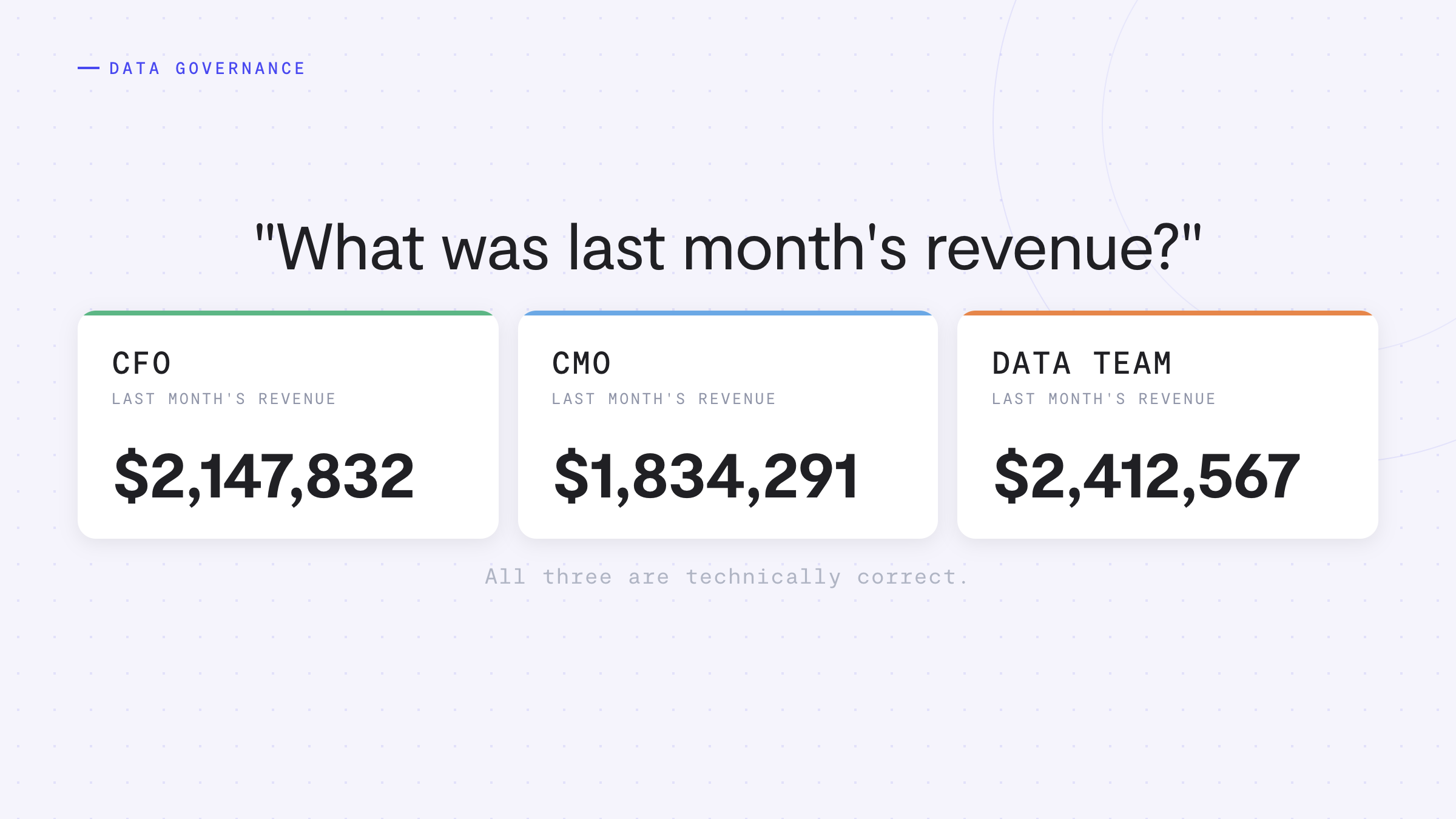
Try this experiment. Pull last month's revenue from your EMR. Now from QuickBooks. Now from the spreadsheet your regional manager maintains. Three systems, three numbers, and the uncomfortable part: nothing is broken. All three are real and defensible, and your organization is quietly making decisions against all three at once.
"Revenue" doesn't exist in your raw data
Your systems record events: an appointment happened, a payment was taken, a refund was issued, a gift card was sold. "Revenue" is not one of those events. Revenue is a decision about which events to add up. Tips in or out? Tax? Gift cards when sold, or when redeemed? Packages at purchase, or as services are delivered? Refunds netted against the day they happened, or the original sale? Every combination produces a different, defensible number, and every tool in your stack has quietly made its own choices. The resulting disagreement is called metric drift, and it isn't a data quality problem. It's an unmade decision, showing up as an argument in your monthly review.
Modeling: raw records become business concepts
Data modeling is the work of turning raw system records into concepts a human can reason about. Raw data is a faithful but ugly copy of what each system stores: cryptic table names, statuses coded as numbers, the same guest existing in three systems under three IDs. Modeling reshapes it into clean tables, typically organized as facts (the events: appointments, payments) and dimensions (the context: guests, services, locations, dates), and, critically, it's where definitional choices get made explicitly and written down. When you see a metric like "New Patient Conversion Rate," you're seeing the output of a model. The number didn't exist in any source system. It was defined into existence, and the quality of the definition is the quality of the number.
The semantic layer: one canonical definition, everywhere
The structural fix for metric drift: A semantic layer is a single, governed place where each metric is defined once, canonically, and from which every dashboard, report, and AI answer is generated. When revenue means one thing everywhere, the monthly review stops being an argument about whose number is right and becomes a conversation about what to do.
One precision: teams can legitimately want different revenue views (finance needs net of refunds for the books; marketing tracks gross bookings). The difference between a healthy organization and a drifting one is whether those differences are intentional, named, and governed, or invisible and compounding.
The definitions meeting: one hour that ends the arguing
You don't need to become a data engineer. You need to force the decisions, once, with finance, operations, and marketing in the room:
- Pick the metrics that matter. For most groups, six cover the arguments: revenue, new patients, retention or rebooking rate, average ticket, provider utilization, marketing cost per new patient.
- Walk the edge cases out loud. Tips, tax, gift cards, packages, memberships, refunds, free consults: in or out, and if in, when?
- Name the variants you genuinely need. Two named metrics beat one contested one.
- Write definitions down where tools can enforce them. A doc nobody opens is a start; definitions codified in a semantic layer are the finish.
- Assign an owner. Definitions change when a new membership product launches or a new location bills differently.
One meeting and a standing owner, against fifteen minutes of reconciliation theater in every monthly review forever, is the best trade in operations.
Chapter 07
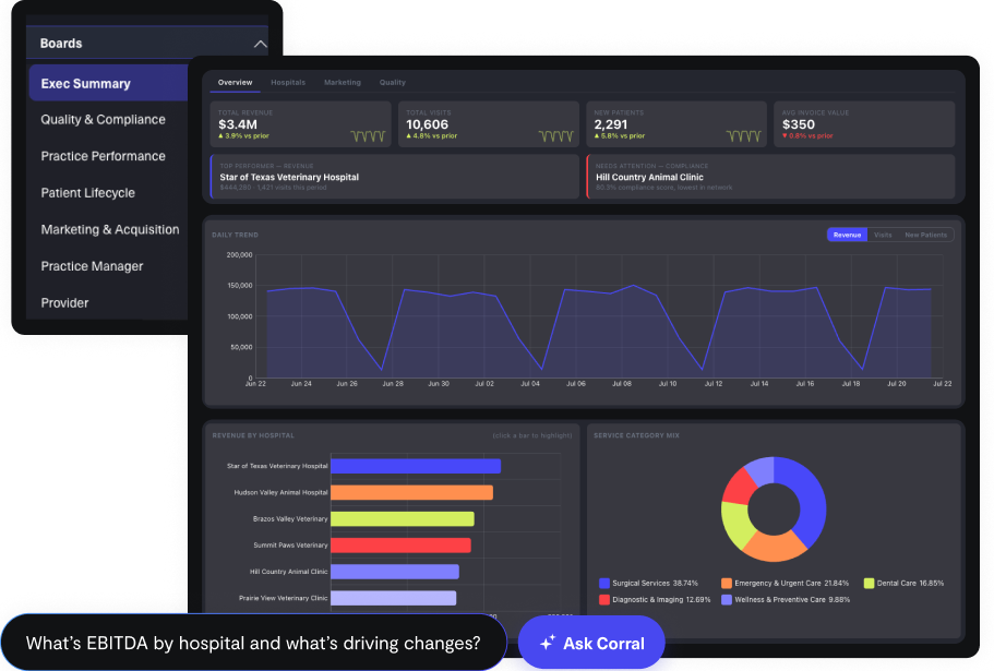
Making Data Usable: Dashboard Design That Survives
Every practice group has one: the dashboard somebody built with great enthusiasm that nobody has opened since the second week. Usually it's beautiful, usually it has fifteen charts, and usually nobody can say what decision any of them supports. That last clause is the entire diagnosis.
The one rule: A dashboard is a screen that helps someone make a decision. If a chart doesn't change what someone does next, it's clutter, and clutter has a cost: every chart competes for attention with every other chart.
Three audiences, three dashboards
The most common failure is showing everyone the same thing. Strategic dashboards serve owners, boards, and investors: a few KPIs over long horizons, always compared to plan or last year, readable in ninety seconds on a phone. Operational dashboards serve managers: the state of the business right now (today's bookings, no-shows, open chairs), checked before every shift and acted on within the hour. Analytical dashboards serve whoever digs: dense with filters and breakdowns, built for "why is this number doing that?" Today's no-show rate is noise to a board member; quarterly trends are useless to a shift manager at 8:45am. Build per audience.
Layout and the five habits
People scan a screen like a newspaper: top-left first, headline before detail. Put the single most important number top-left, big; trend charts explaining it below; tables and filters at the bottom for the minority who dig. Then five habits separate used dashboards from dead ones:
- Show the comparison. $450K in revenue is meaningless alone. A number without a "versus" forces every viewer to find context elsewhere.
- Less is more. Six charts people act on beat twenty they scroll past.
- Label like you'll be screenshotted. Because you will be. Title, units, time range, legend: every chart should survive being pasted into a deck alone.
- Default to the right story. Filters should open on "last 30 days, all locations," not whatever the last person left them.
- Show the freshness. Half of all "this number is wrong" moments are really "this number is from this morning."
A makeover, and the survival secret
The fifteen-chart "Company Dashboard" becomes two boards. The owner board: revenue vs. plan, same-store trend vs. last year, new patients vs. plan, retention trend, marketing cost per new patient. Five charts, every one comparative. The manager board, defaulted to the viewer's own location: today's schedule fill, this week's no-show rate vs. trailing average, rebooking rate, open chair hours for the next seven days. Four charts, each mapping to an action a manager can take this week. The provider production table moves to an analytical board; the eleven-slice pie chart goes to a better place.
And the survival secret: a dashboard needs a ritual. The owner board opens the monthly review; the manager board runs the 9am huddle. A board woven into a standing meeting stays accurate (errors get noticed in a day) and stays relevant (when the meeting's questions change, the board follows). A dashboard nobody is scheduled to look at is a dashboard nobody looks at, no matter how good the design.
Chapter 08
AI Analytics: How It Works and When to Trust It
"How do I know it isn't making this up?" It's the first question every operator asks about AI analytics, and it's the right one. The answer isn't faith. It's architecture.
The AI doesn't know your numbers
A large language model has never seen your revenue and can't recall your numbers from memory, which is exactly why a general-purpose chatbot is the wrong tool for business questions. What a model is genuinely good at is translation: turning a plain-English question into a database query. The pattern is called text-to-SQL: you ask "what was Botox revenue by location last month?"; the AI is shown the map of your data (table and column names and definitions, not the data itself); it writes a SQL query; the query runs against your actual warehouse, the same one powering your dashboards; and the result comes back as an answer or a chart. The number came out of your warehouse, not the model's imagination, and the AI's contribution, the query, is inspectable, the same way you'd check a junior analyst's work.
Where it goes wrong, precisely
Hallucination, the famous failure, is a model producing fluent text with no basis. In a well-built analytics system it's contained by construction: answers must come from real queries against real data, and the query is visible. The subtler, more common problem is ambiguity. If your warehouse has three amount columns and you ask for "revenue," the AI must guess which you meant, and it will guess reasonably, sometimes reasonably wrong, with total confidence. The answer looks right; the query even ran; it just ran against an interpretation instead of a definition. When definitions live inside individual queries, every query is an inference, and the same question can produce different answers depending on who or what asked. Systems like that don't fail loudly. They drift.
Grounding: why governance decides whether AI is right
The defense is grounding: anchoring the AI in an authoritative source instead of letting it improvise. In practice that means the things this guide has already covered: modeled data (Chapter 6), so the AI has less room to guess, and a semantic layer of canonical metric definitions, so the AI's interpretation of revenue becomes your company's definition of revenue. Not a guess; a lookup. This is also why data governance, not just data volume, is what determines whether AI analytics is trustworthy. See our Data Governance guide for the fuller picture.
AI accuracy on analytics evals against ungoverned data
Accuracy with a governed stack underneath. Same model, same questions.
"Just point AI at your raw data," however slick the demo, is the trap: wrong answers that look right, arriving instantly with a chart, which is the kind nobody double-checks.
The trust checklist
Apply this to any AI analytics product. Provenance: can you see the query and definitions behind an answer? That's the difference between trusting a number and forwarding a mistake to your board. Canonical definitions: is there one codified definition per metric with an accountable owner, or does "the model figure it out"? Honest limits: does it say "we don't track that" instead of always producing a chart? Measured accuracy: is there an evaluation process, or does nobody, including the vendor, know the error rate? Human decisions: AI compresses the time between question and answer; the decision stays yours.
And the payoff, once trust is architectural rather than aspirational, is real: instant answers to ad-hoc questions, non-technical operators self-serving, and the questions you never used to ask (because asking was expensive) finally getting asked. That last category is where most of the value hides.
Chapter 09
Security, Privacy, and HIPAA: Protecting Patient Data
If you run a healthcare-adjacent practice, every analytics conversation eventually collides with a compliance question, and projects stall while everyone waits for someone else to find out the answer. The rules are more navigable than they sound. (Orientation, not legal advice; your counsel gets the final word.)
PII, PHI, and the design insight most operators miss
PII is anything that identifies a person: name, email, phone, birth date. PHI (Protected Health Information) is health information tied to an identifiable person, and HIPAA regulates it far more strictly. The distinction doing real work: "we sold 340 units of Botox last month" is an aggregate metric anyone can see; "Jane Doe received Botox on April 12" is PHI. The same records produce both, and which one your reporting exposes is a design decision.
The insight: Aggregation and careful modeling are privacy tools, not just analytics techniques. A well-designed executive dashboard answers nearly every leadership question without a single patient name on screen.
Two scenarios that trip up real practices. The marketing list ("everyone who got filler six months ago and hasn't rebooked") is PHI, full stop: legitimate inside a compliant workflow, a violation when exported to a spreadsheet and emailed to an agency. The investor deck (service mix and retention across the portfolio) involves no PHI at all when handled as aggregates, and the obligation only appears if someone forwards patient-level exports instead of the rollup. Same data, radically different obligations, purely based on the shape it travels in.
The BAA: the document that makes vendors accountable
HIPAA directly regulates covered entities (providers, plans, clearinghouses; whether your medspa qualifies depends on specifics like electronic insurance billing, and prudent groups behave as if it does). Vendors handling PHI on your behalf are business associates, and HIPAA requires a contract with them: the Business Associate Agreement, which spells out how PHI is protected, what happens in a breach, and what the vendor may do with your data. Without it, sharing PHI with that vendor is itself a violation. Practical translation: asking "will you sign a BAA?" is normal diligence, mature healthcare vendors have one ready, and a vendor who hesitates or says "you probably don't need that" has answered a different, more important question.
Minimum necessary: the principle worth internalizing
HIPAA's core operating idea: use and expose the least PHI needed for the task. For analytics, that means syncing the fields you need rather than everything (clinical notes almost never belong in business analytics), preferring aggregate views wherever aggregates answer the question, scoping access by role and location (a manager sees their location, not five years of everything, enforced by role-based access and row-level security), and keeping an audit trail of who accessed what. De-identification, stripping identifiers so data no longer counts as PHI, is the related tool that lets reporting move freely.
The six questions for any analytics vendor
- Is data encrypted in transit and at rest?
- Is our data isolated from other customers?
- Will you sign a BAA if patient-level data is involved?
- Can access be scoped by role and location, down to the row?
- Is there an audit trail?
- Can you design our reporting so PHI stays out of dashboards wherever aggregates suffice?
Serious vendors answer all six without flinching, and the sixth separates vendors who understand this space from vendors who merely tolerate it. One reframe to leave with: HIPAA constrains how patient data is handled, not whether you can understand your business. Retention, productivity, marketing ROI, portfolio rollups: all achievable inside a compliant design, and the design work is your vendor's job, not yours.
Chapter 10
When Numbers Look Wrong: The Troubleshooting Playbook
Sooner or later you'll pull up a dashboard and a number will look wrong. What you do in the next five minutes determines whether this costs you a morning or thirty seconds.
The first fork: stale or wrong?
A stale number was right when computed but hasn't refreshed: you're comparing a live EMR screen at 2:05pm to a dashboard that synced at 1:00pm, and the gap is a clock, not a bug. A wrong number is current and genuinely doesn't match the source's own report for the identical period and filters. So the first move, always: check the dashboard's as-of time, and ask "what am I comparing this to, and as of when?" A remarkable share of alarms dissolve right there. If the data is genuinely stale, Chapter 3's three sync failures are the suspects: expired credentials (yours, one minute to fix), rate limiting (self-heals), source outage (retries automatically).
If it's genuinely different: the five usual suspects
- Definition mismatch, the big one: your dashboard's "revenue" and the source's built-in report include different things (tax, tips, refunds, gift cards, packages), and both are right by their own definition. The real question is which definition you want to run the business on (Chapter 6).
- Timezone boundaries: sources store timestamps in universal time while you think locally, so a 7pm San Diego appointment is tomorrow in UTC. The tell: weekly totals match while individual days wobble at the edges.
- Cancelled and refunded items counted by one report and not the other.
- The unnoticed filter: a board quietly set to one location or an old date range. The most embarrassing item on the list and the one everyone gets caught by. Check it first; it takes ten seconds.
- Different date fields: "booked yesterday" and "happened yesterday" are different questions, as are revenue by service date versus payment date, which diverge every time someone prepays a package.
A worked example
A dashboard shows $84,760 for last week against the EMR's $86,000. The trace: $900 is gift cards (counted at sale by one report, at redemption by the other), $310 is two late-Sunday appointments pushed across the week boundary by UTC, $30 is a refund netted to different dates. Gap explained: $1,240. Actual data errors: zero. Decisions surfaced: one worth making, about gift cards.
Reporting a real issue so it gets fixed same-day
If the checklist doesn't explain it, you may have found something real. Five details turn days of back-and-forth into a same-day answer: (1) which dashboard and which specific chart; (2) expected vs. actual number with exact date range and filters; (3) the source report you compared against and when you ran it; (4) screenshots of both; (5) the dashboard's as-of time. That package lets your analytics partner skip a day of "what exactly were you looking at?" and go straight to diagnosis.
The bigger point: Numbers that "don't match" are rarely a data quality failure. They're usually a definition or timing difference wearing a scary costume, and watch how your analytics partner responds when something real does surface. Fast, structured, and transparent is the mark of a partner who treats your trust as the product, because it is.
Want to see all of this working on your own data?
CorralData builds and operates the governed data stack described in this guide: pipelines, warehouse, modeling, semantic layer, dashboards, and AI, run for you by a dedicated team.
Book a Demo